ABSOLUTE FINAL CALL: Steno Signals #207 – The Grand Tour of All the Leading Indicators
Having been on vacation for a couple of weeks, I updated all of our leading indicators first thing upon returning to the office. Here’s your must-read guided tour throughour major leading indicators.

***Action Required to Continue Receiving Steno Research
Steno Research is joining forces with Real Vision! To continue receiving our research, you’ll need to sign up through Real Vision. This is the last call and no further research will be distributed via Substack.
If you’ve prepaid for a full year on Substack, please contact us at info@stenoresearch.com, and we’ll guide you through the process. For everyone else, please visit https://app.realvision.com/pricing to sign up.
We look forward to seeing you over at Real Vision! ***
It’s good to be back at the office after a few weeks away—refreshed, recharged, and once again reunited with my beloved espresso machine. I’m generally happy to report that our base-case assumptions around the EU–US trade relationship appear to be holding up nicely—alongside most of our main macro views. July has been a tremendous month for us in many ways; I hope it’s been equally kind to you. After briefly assessing the weekend’s main events, I’ll give you a quick “grand tour” of our model package—basically the first thing I updated upon returning to the office.
Trump, ever the showman, dropped his “50:50” rhetoric on Friday to hammer out a few final details with the EU. It seems Brussels has finally cracked the Trumpian code: promise some big shiny numbers, get a photo op, and voilà—deal done. I expect we’ll see plenty more handshakes and signature moments in the weeks to come now that Trump’s hand has been played.
On the FX front, the USD staged a comeback after the initial overnight sell-off. That did catch me a bit off guard, I’ll admit. But with the benefit of hindsight (and caffeine), it makes some sense:
The market sold the USD on trade war escalation;
And now, like a hungover trader on a Sunday morning, it’s buying back in as the (tariff) war winds down.
If this logic sticks, the next leg of USD weakness will likely require Trump to start undermining the Fed’s credibility again—which, let’s be honest, is well within his skillset. That could finally give the dollar bear story some legs. (And yes, I still think it has legs—though maybe slightly wobbly ones.)
On top of that, it’s actually fairly normal to see the USD weaken in a “re-inflation” phase, where global growth picks up speed simultaneously—arguably the most likely scenario heading into year-end (see Chart of the Week). I’m aware that a “weak USD” is something of a consensus trade, but we still have the dark horse of a very soft Fed development if Trump gets his way—as he typically does (just look at the trade deal with Europe).
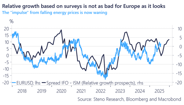
Chart of the week: EURUSD can still rise into year-end on re-inflation prospects
A few thoughts on the EUR/US trade deal:
The EU’s actually in a relatively good spot. A 15% hit isn’t catastrophic—especially when you stack it up next to China. And with 25–50% sectoral tariffs still in play, there’s room to build in Europe and ship it across the pond e.g. in Copper and/or Steel intensive sectors. Call it transatlantic tariffs-arbitrage.
The EURUSD sell-off strikes me more as a signal that tensions between the EU and US are now buried—both in NATO and on the trade front. That takes pressure off European institutions to diversify away from the USD. Less stress, fewer emergency meetings in Frankfurt.
Based on that, we should probably expect European trading sessions to be less USD-negative than we’ve grown used to. And who knows—maybe we’ll even see the EUR start buying the US session for a change. Stranger things have happened.
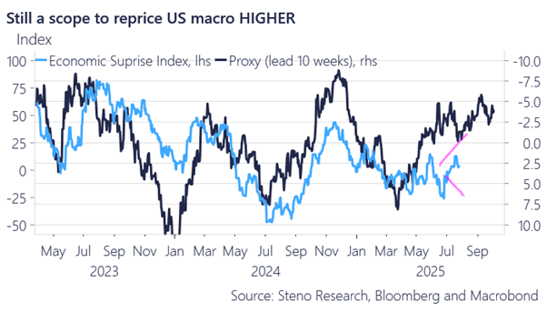
Having said that, there is a meaningful rebound underway in US macro surprises as we have predicted, which holds the potential to at least temporarily halt the USD weakness until the Trump/Fed relationship becomes a bit clearer. In the following, we will go through all of our best leading indicators for the US economy (we will follow up with more on China, India, the EU and more in our Macro Meets Micro later this week).
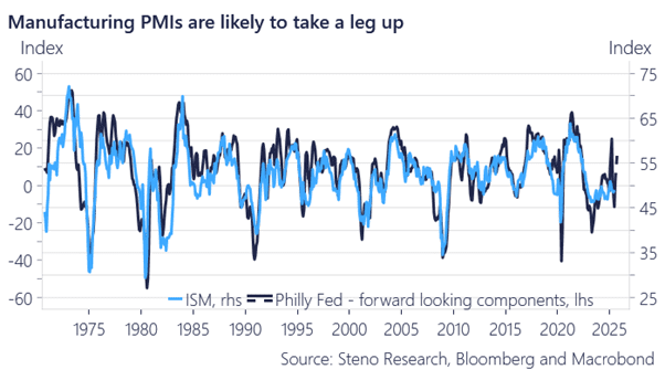
For starters, we consider a “secret recipe” of the more forward-looking components of the Philly Fed survey to be the best directional guide for the ISM Manufacturing Index 1–2 quarters ahead. We acknowledge that the PMIs—especially the regional ones—have been incredibly choppy for a while, but we’re starting to see the outline of a very solid comeback in the best forward-looking components of the survey(s). Expect >55 prints within 3 months from now. The cycle is undoubtedly improving, even if most investment banks are still trying to tell you otherwise.
Chart 1: US Manufacturing is recovering momentum
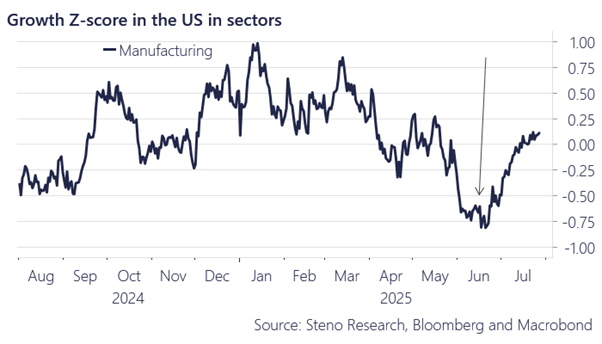
It rhymes well with the observations we make in our nowcasting of US manufacturing activity, which seems to have bottomed in June. Electricity demand, congestion (trucks on the road), tax-based measures, and activity in ports all suggest that we’re on an upward trajectory.
Given the structure of these PMIs (i.e., is activity going forward or backward compared to a month ago), such a sharp acceleration in rate-of-change terms is likely to lead to PMIs solidly above 55 in manufacturing within 1–2 months.
Chart 2: Nowcasted Manufacturing activity in the US is rebounding
Isn’t such a “reopening” reacceleration of the US economy already priced in now that we have trade deals behind us, you might argue? I’d argue that, given the response from equities—with very solid momentum—clear evidence that smart money investors have remained bearish in their positioning, and the still dire tone in various investment bank outlooks, we have yet to see the full scope of the “surprise” this will lead to in terms of US growth relative to expectations.
Our simple, yet solid, indicator—based on the USD, energy prices, and bond yields/spreads—hints that economic surprises could jump to 75 index levels between now and October. That’s yet another sign that the economic consensus is still playing catch-up to the reacceleration we’re in the early stages of.
Chart 3: More positive macro surprises are coming
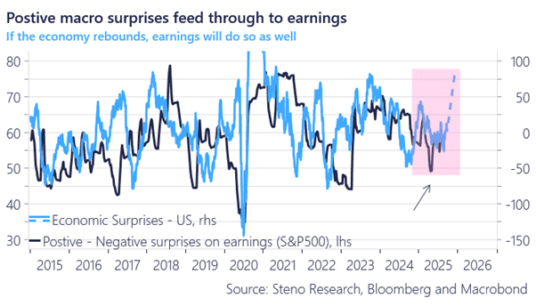
The earnings season—set to peak in relevance this week—is another testament to this trend. Earnings surprises typically lag macroeconomic surprises by 1–2 months, and if we assume a rise to 75 in the macro surprise index, we’re likely to see an explosion of positive surprises in earnings alongside it during Q3.
So far in the Q2 earnings season, 84% of reports have beaten earnings expectations. The economic consensus is still not on board the re-acceleration train.
Chart 4: Macro surprises -> earnings surprises 1-2 months later
I get that we’ve had vibes lately that are somewhat reminiscent of the happy-go-lucky Roaring Kitty days—complete with massive, Sydney Sweeney–fueled single-name rallies and the like—but are we really in 2021-style territory, or are we still much earlier in the cycle? Let’s take a look at a few indicators.
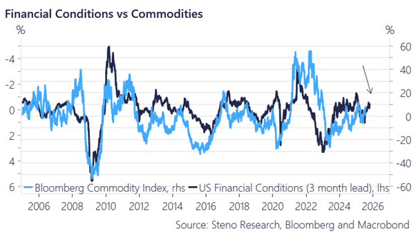
Judging from financial conditions—the ultimate guiding star for market behavior—we’re on an easing path, but still far from the frothy conditions of 2021. We’re therefore most likely only in the early stages of the commodity/mining re-inflation, and we remain in those bets for exactly that reason. This is still the part of the cycle where everything can go up in tandem.
Chart 5: Financial conditions are easing, but remain far from 2021 pace
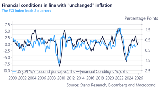
This is also why we consider inflation fears to be blown out of proportion. Inflation momentum (the change of the change) tends to follow financial conditions with a lag of a couple of quarters. And while the disinflation phase is behind us, we’re still in a relatively flat environment, with inflation roughly holding steady in year-over-year terms. That’s hardly something to get overly worried about.
Chart 6: Inflation likely to trend sideways
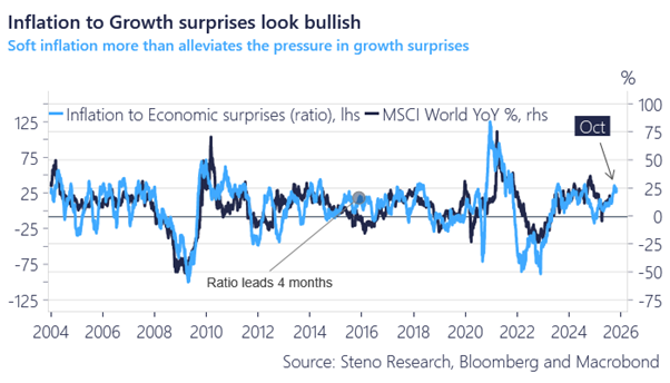
With growth re-accelerating relative to expectations, and inflation remaining fairly tame by comparison, we have the most bullish surprise cocktail imaginable. Our relative surprise indicator (growth vs. inflation) is still firmly in bull territory—and it tends to lead returns by approximately 3–4 months.
Chart 7: Growth to inflation surprises in BULL-territory still
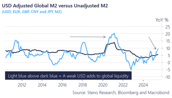
And all of this is happening while the global money footprint continues to ease—especially in USD terms, thanks to the weaker dollar. In Chart 7, we show global M2 growth in year-over-year terms, both in local/fixed currency and USD-denominated terms. The re-acceleration of global money trends is still mostly a USD story for now, but it’s beginning to broaden in local FX terms as well—up 5% in local currencies and over 10% in USD terms compared to a year ago.
When the USD leads the liquidity cycle—as it did in 2020, 2017, and 2017/2018—we typically see a catch-up in local currency terms too, which constitutes a broader softening of financial conditions.
Chart 8: Global money trends going up both in local- and foreign FX terms
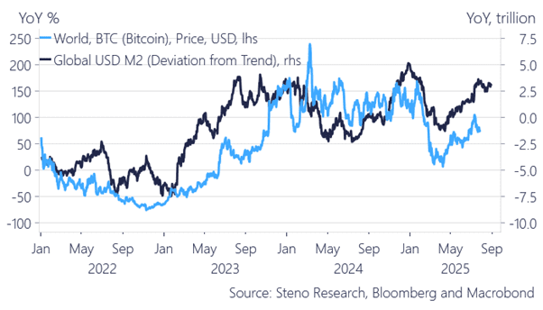
Accordingly, we have yet to fully see Nasdaq, Bitcoin, and other gauges of risk catch up to the monetary environment—likely because the (understandable) wall of worry following the Liberation Day market chaos still lingers and weighs on risk-taking. This “liquidity gap” will take some time to fully close in market terms. There’s still more upside left.
Chart 9a: Nasdaq versus M2 (compared to trend)
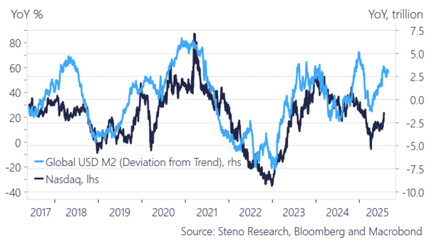
Chart 9b: Bitcoin versus M2 (compared to trend)