

4 charts that will make you go HMMM..
We have launched our Seasonality Watch series and find that up to 50% of the rebound in January/February is manufactured in a spreadsheet. Will trends reverse in March/April?

We have listened to the feedback and implemented a 2 week trial for subscriptions to Steno Research.
Get your FREE 2 week trial here → https://stenoresearch.com/subscribe/
Inflation remains the KEY driver of everything across assets. This has been evident throughout the beginning of 2023 as equities have recently sold off despite a pretty decent comeback to growth (on the surface). A sell-off ignited just because inflation allegedly re-accelerated alongside it.
We find several similarities to the surprising spike in prices in August/September after the first peak in annualized price pressures in June-2022. After all, disinflation was never going to occur in a straight line.
Let’s have a look at a few interesting observations which may make you more comfortable on the inflation outlook.
Chart 1. Perfect inverse relationship between S&P 500 and inflation since 2021

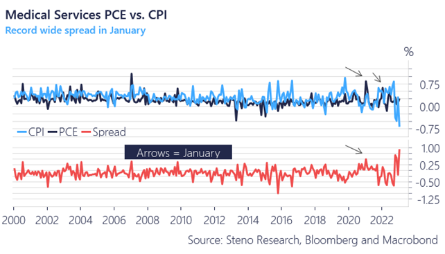
The PCE price report made for more uncomfortable reading than the CPI report for the Federal Reserve. Out of several differences between the two reports, the spread between medical service prices in the CPI relative to the PCE was the most eye catching. The medical services printed at almost 0.3% MoM in the PCE index, while it printed at almost -0.7% MoM in the CPI.
We are now stuck with an ALL-TIME-HIGH spread between the CPI and the PCE in this category, which has been a growing issue since the pandemic. We have had major distortions to January numbers (in spread terms) between the PCE and the CPI each year since 2021 in this category, and the gap has closed from the top each year (PCE coming down to CPI over the spring).
Will this year be different? Probably not as this is most likely driven by front-loading of premiums relative to benefits in the retained earnings methodology in the CPI index.
This speaks in favor of fading current price pressures in the inflation index from a momentum perspective.
Chart 2. The spread between PCE and CPI on medical services is ALL-TIME-WIDE
Want to find out MORE (and the rest of the charts)?
We have listened to the feedback and implemented a 2 week trial for both basic- and premium subscriptions to Steno Research.
Get your FREE trial here → https://stenoresearch.com/subscribe/
Try out the worlds leading independent macro research shop for 2 weeks for FREE and remember our 100% money back guarantee if you dislike the product once you become a client.
We only want happy members!
